Lack of awareness
Riders cannot use tools they do not know exist.
UBER SAFETY / UX RESEARCH + PRODUCT DESIGN
Rethinking Uber’s ride-hailing safety experience to make support easier to notice, understand, and use across every stage of a trip.
Research • Strategy • Interaction design • Mobile experience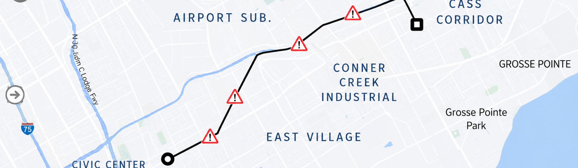
PROJECT CONTEXT / THE CHALLENGE
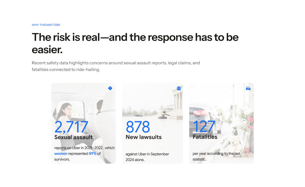
Safety features such as sharing a trip, emergency calling, and driver verification are often hidden behind multiple taps. In high-stress moments, every second counts—but riders must first remember that the tools exist, find them, and decide whether the situation is serious enough to use them.
THE CURRENT EXPERIENCE
I mapped the current safety experience across pre-trip, in-trip, and after-trip moments to understand what support is available—and when riders are expected to find it.
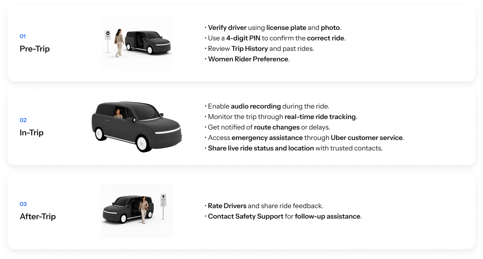
The gap was not the absence of safety tools. It was discoverability, speed, and confidence in what happens next.
WHERE THE EXPERIENCE BREAKS
Riders cannot use tools they do not know exist.
In emergencies, every second matters and safety actions need immediate visibility.
Riders need stronger confirmation that the driver and vehicle match the information shown.
After reporting, a lack of transparency makes the process feel uncertain and high-stakes.
WHAT WE HEARD FROM RIDERS
Rider and driver interviews revealed six recurring behaviors, concerns, and coping strategies across the trip.
Riders check their own map—or the driver’s phone—to make sure the route feels correct.
In stressful moments, riders want fewer steps and faster access to help.
Many riders leave a low rating instead because formal reporting feels unclear or too consequential.
Riders share live location, trip details, or screenshots with people they trust.
Calm driving and respectful communication build trust; personal questions or unusual behavior can quickly undermine it.
Speeding, hard braking, and risky turns make riders feel they have less control.
DEFINING THE AUDIENCE
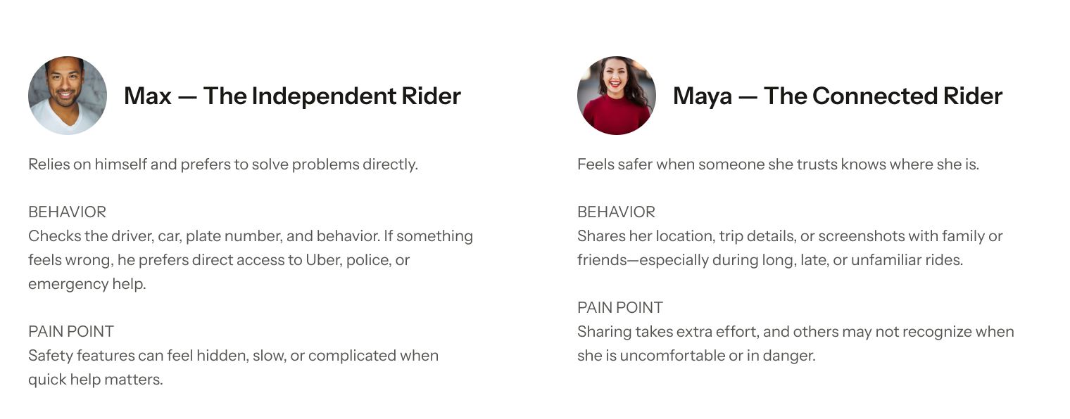
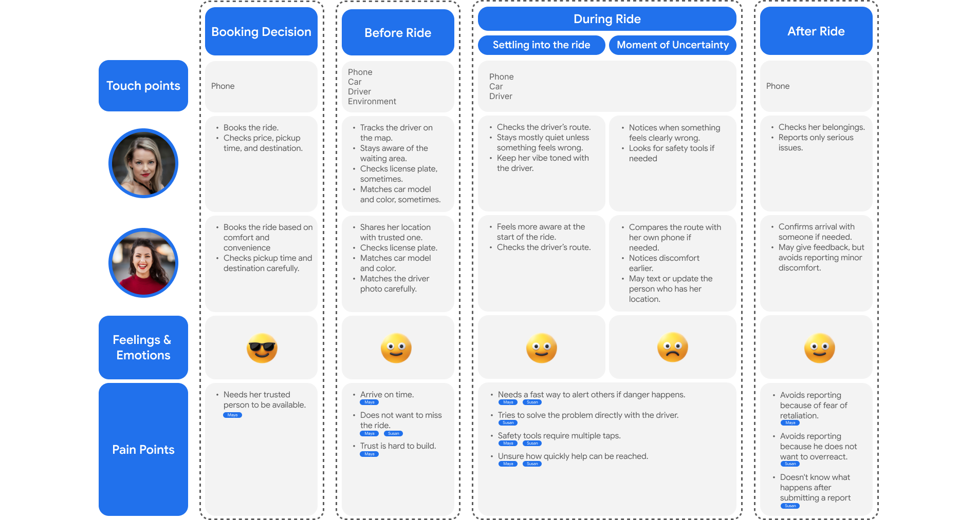
The project direction had to support both self-reliant riders and riders who feel safer when a trusted person stays connected.
MAPPING THE FULL RIDE
Comparing Max and Maya revealed the specific moments when riders seek control, involve others, hesitate to report, or need faster access to help.
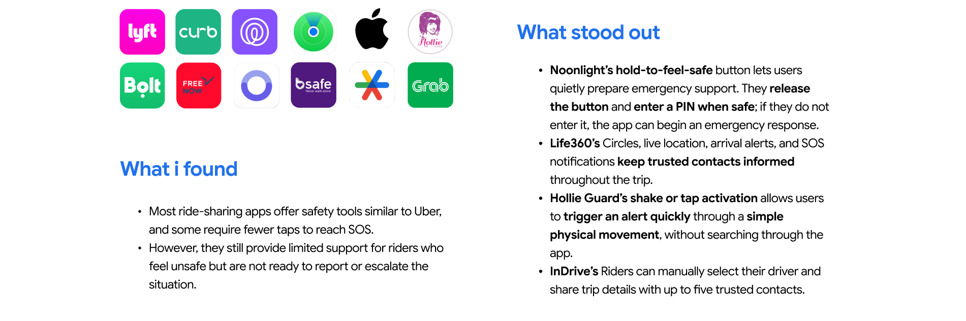
LEARNING FROM OTHER SAFETY PRODUCTS
Comparing ride-sharing and personal-safety apps revealed patterns for faster activation, quiet escalation, trusted-contact visibility, and reassurance before an emergency.
DEVELOP / PRIORITIZATION
After expanding the solution space, I evaluated each concept by its potential value for riders and the effort required to deliver it. This narrowed the strongest ideas into a focused feature direction.
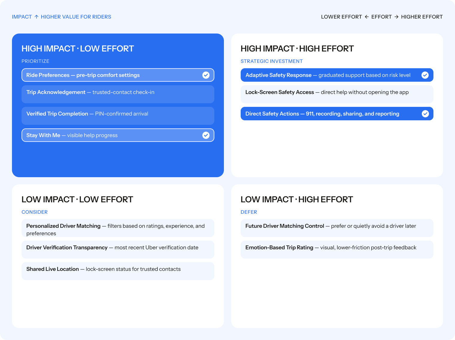
DEVELOP / CONCEPT DIRECTION
The matrix narrowed a broad set of possibilities into four connected features that support riders before, during, and after a trip.
Comfort starts before booking.
Support changes as concern changes.
Help remains visible and transparent.
Critical tools stay within reach.
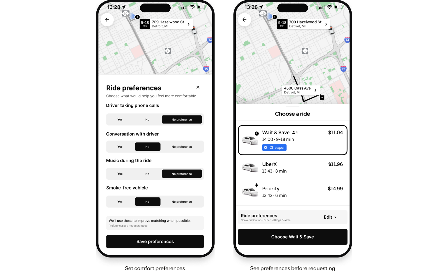
FEATURE 01 / BEFORE THE RIDE
Ride preferences let riders communicate everyday comfort needs before pickup. Selected settings stay visible on the ride option, connecting comfort directly to the booking decision instead of burying it in account settings.
FEATURE 02 / DURING THE RIDE
A persistent safety control makes reassurance visible without demanding attention. Moving from Safe to Concerned quietly starts protective actions, then asks for just enough context to guide the next response.
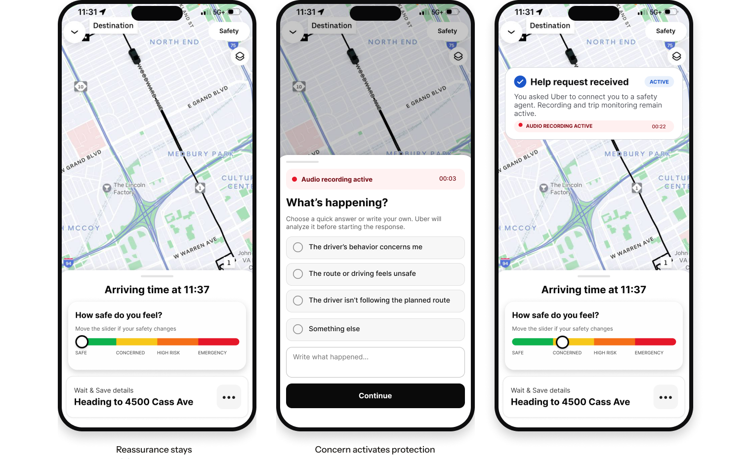
FEATURE 03 / GUIDED SUPPORT
Stay With Me connects the rider to a safety agent, keeps automatic protection active, and makes every step visible. Riders can reply, choose a quick answer, or remain silent while monitoring and recording continue.
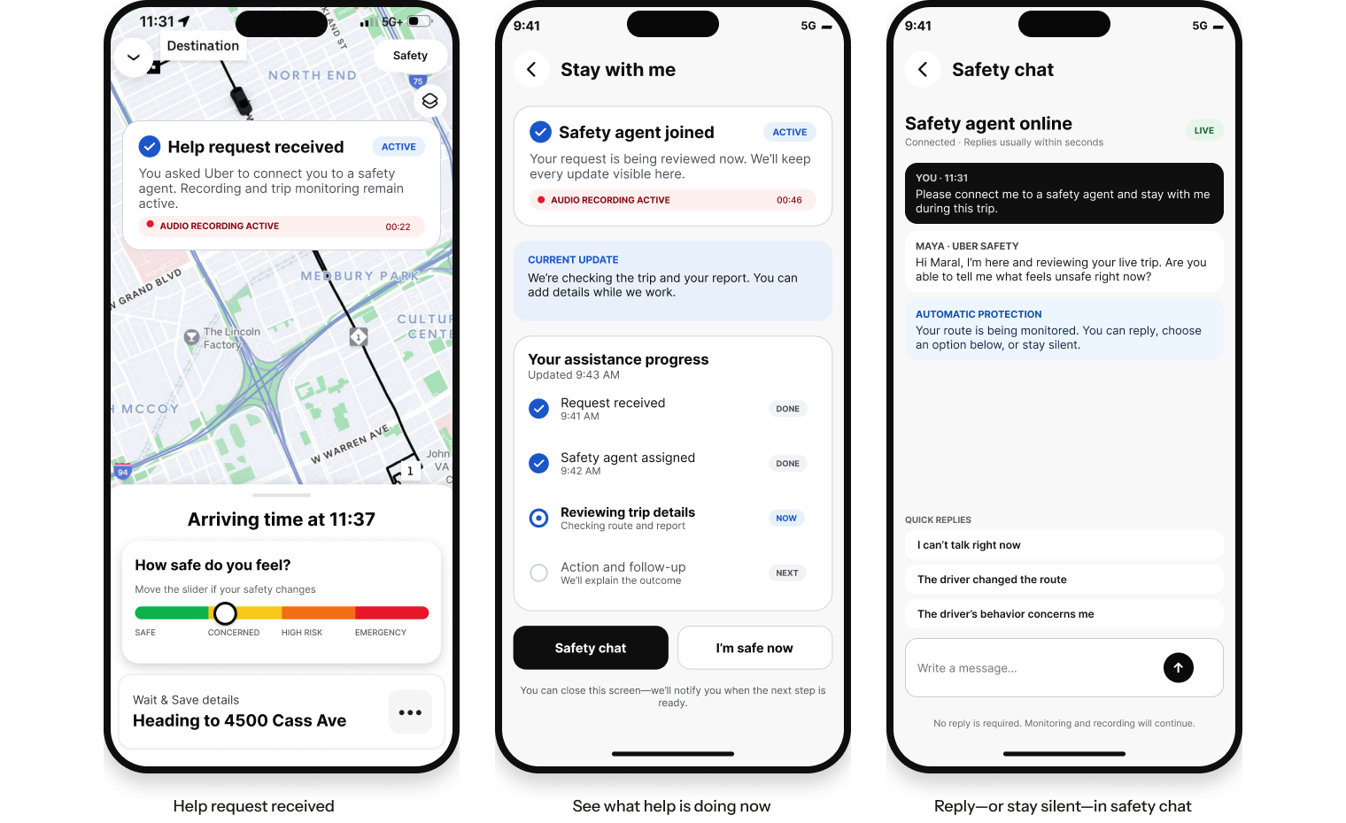
FEATURE 04 / DIRECT SAFETY ACTIONS
The safety menu opens distinct flows for emergency calling, audio recording, trip sharing, and issue reporting. The four states focus on confirmation, persistence, and clear follow-up.
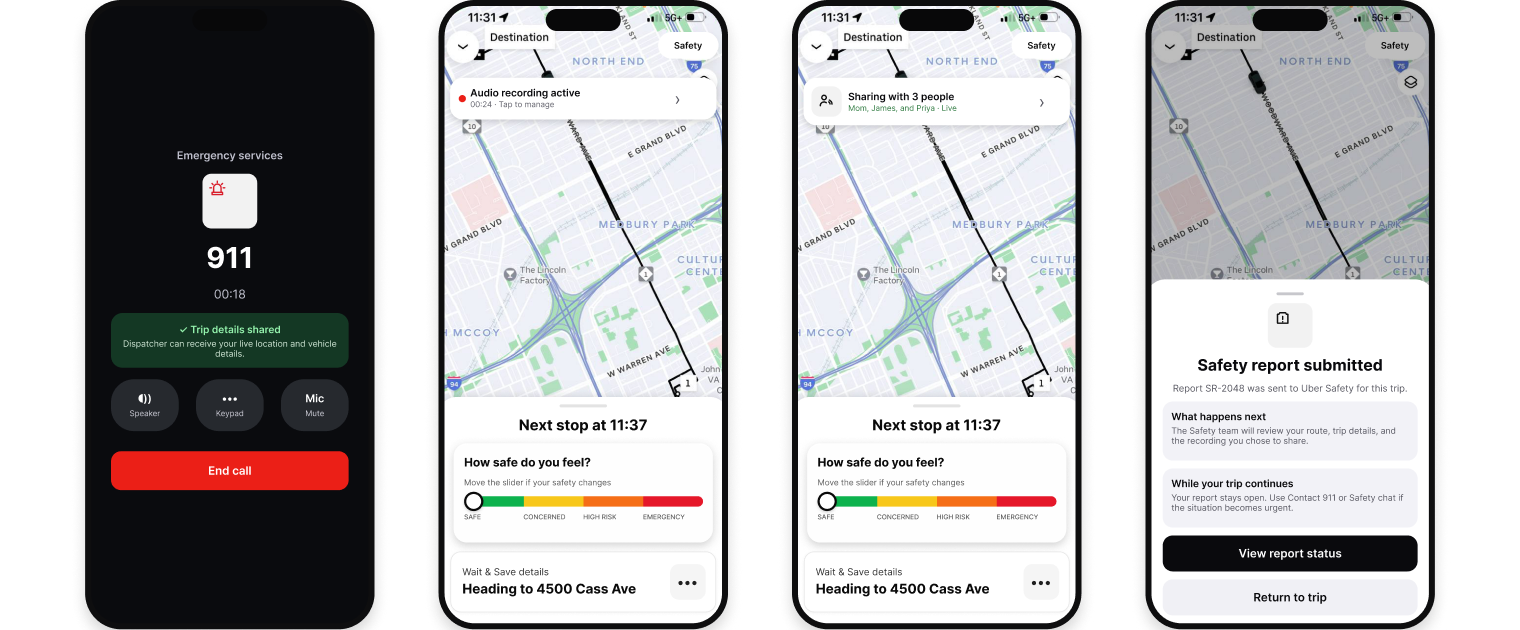
DEVELOP / USABILITY TESTING
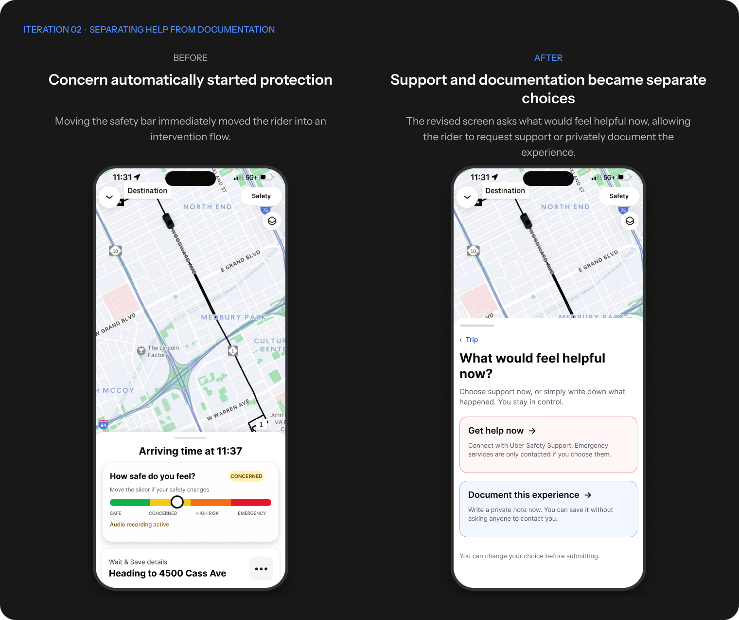
Rather than redesigning the entire experience, the revisions focused on where the participant needed clearer navigation, more choice, and greater control over escalation.
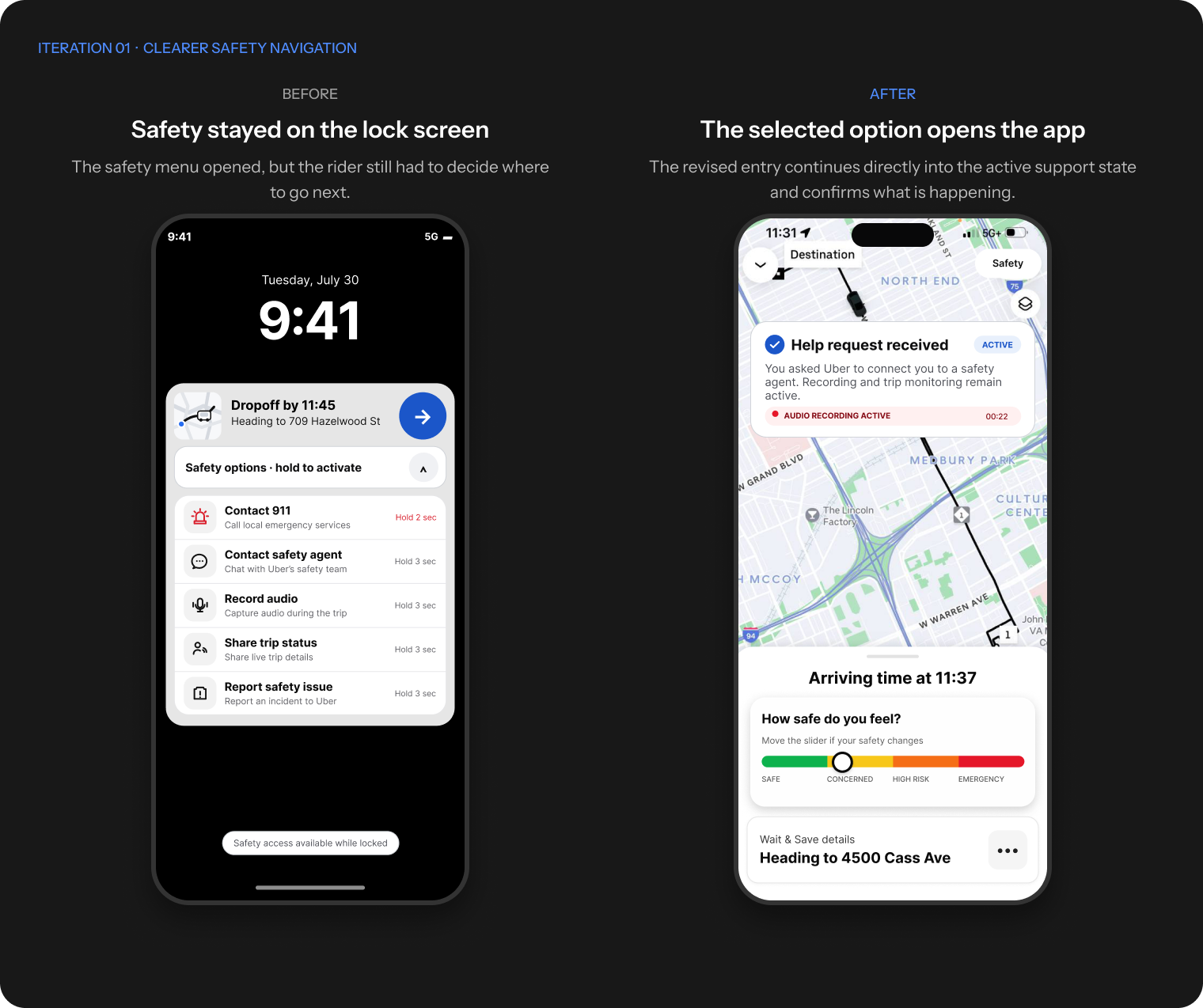
DELIVER / USABILITY TESTING
One moderated usability session focused on the safety entry points, slider, and response flow.
DELIVER / FINAL RESULT
The final prototype connects prevention, graduated response, documentation, and visible follow-up in one continuous experience. Riders can ask for urgent help, stay accompanied, or simply record what happened—without being pushed into escalation.
Ride preferences reduce avoidable discomfort before booking.
The adaptive safety control keeps support visible and proportional to concern.
Riders choose immediate help or document the experience without forced escalation.
Visible progress, safety chat, saved notes, and case summaries preserve clarity and control.