01 / Discover
Existing app review
100+ app-store reviews
Competitive analysis

UX RESEARCH + PRODUCT DESIGN / APP REDESIGN
A more flexible Opal experience that helps people protect their attention while making room for everyday interruptions.
8 WEEKS / TEAM OF 2 PRODUCT DESIGNERS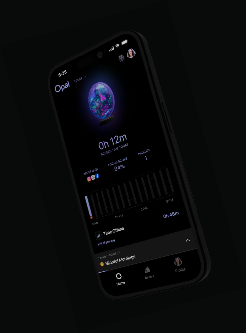
PROJECT CONTEXT / THE CHALLENGE
Opal helps people limit distractions through app blocking, scheduling, and screen-time controls. Our redesign explores what happens when those controls meet changing motivation, work messages, and everyday responsibilities.
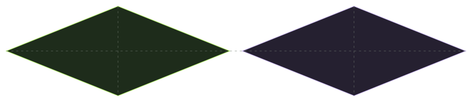
THE PROCESS / DOUBLE DIAMOND
The case study follows four stages: exploring the existing experience, defining different focus needs, developing and testing alternatives, and bringing the refined interactions together.
Existing app review
100+ app-store reviews
Competitive analysis
Two focus mindsets
Journey mapping
Design opportunities
Effort–impact mapping
Feature exploration
Usability testing + iteration
Refined interactions
Four prototype walkthroughs
Reflection + next steps
01 / DISCOVER / EXISTING EXPERIENCE
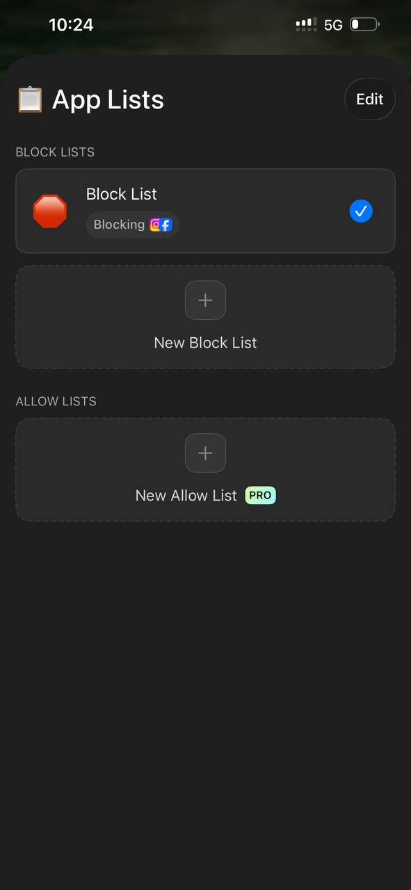
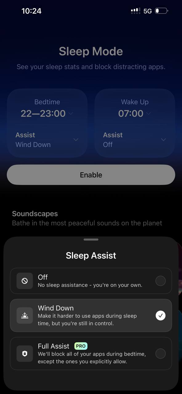
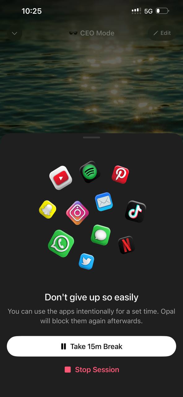
We examined how people set up restrictions, start focus sessions, and leave a session when their needs change.
People manually choose which apps to block or allow.
Preset modes ask people to choose a fixed level of control.
Restrictions depend on a planned period of focus.
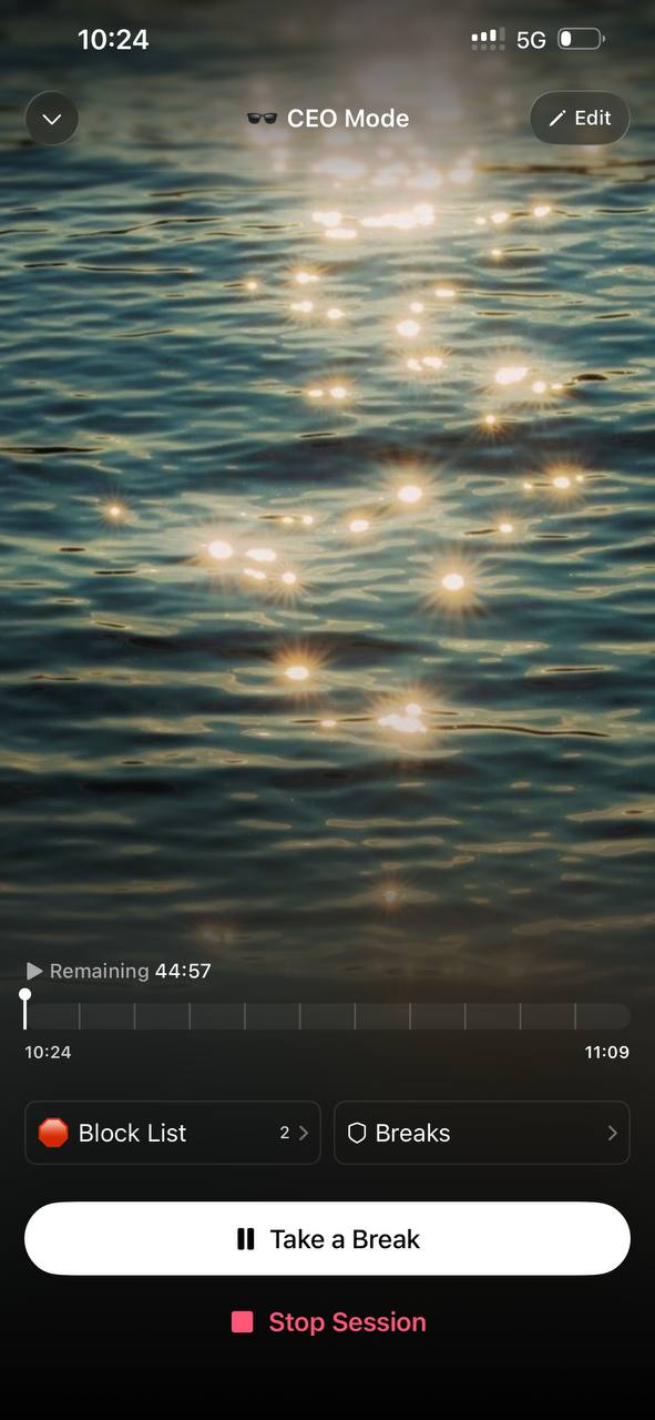
Breaks allow flexibility, but can also weaken commitment.
01 / DISCOVER / REVIEW ANALYSIS
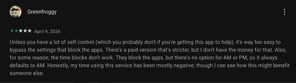
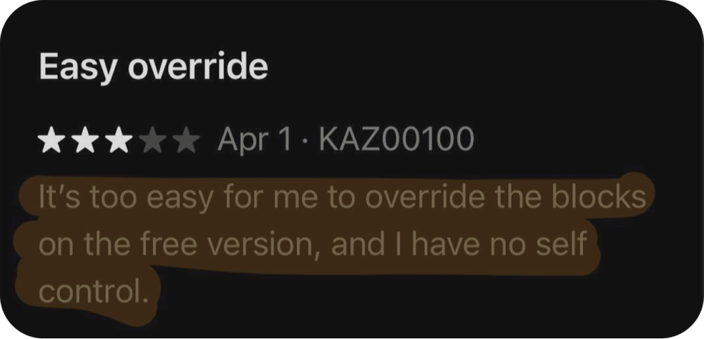
We synthesized 100+ App Store and Google Play reviews. Recurring themes pointed to a mismatch between fixed restrictions and the situations people actually face.
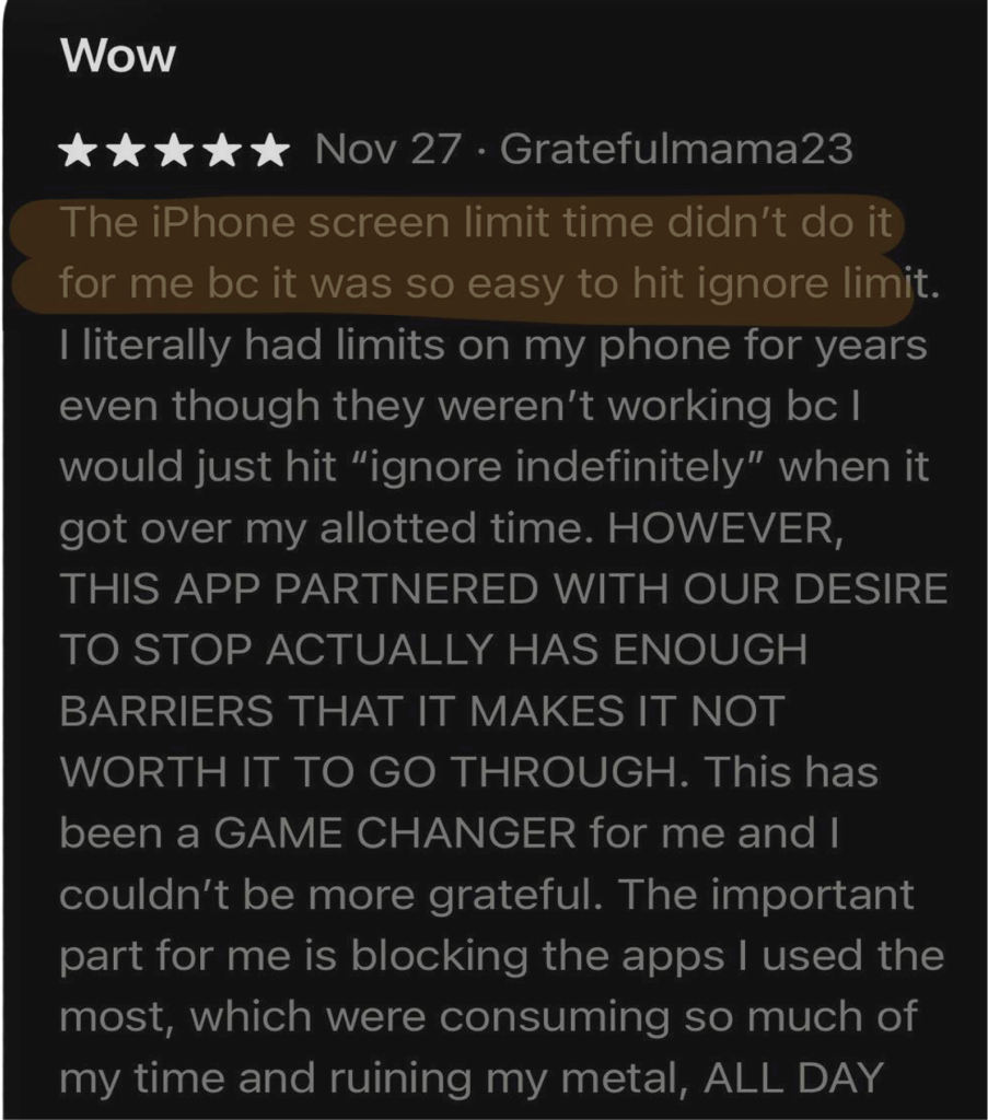
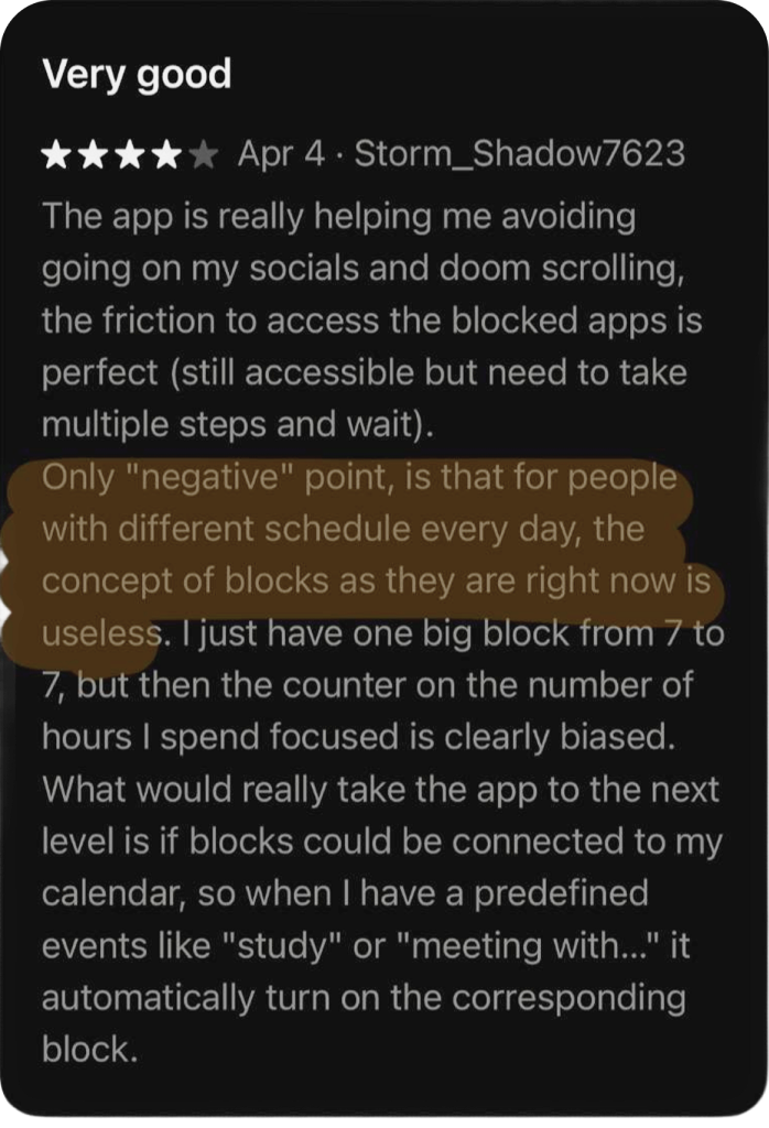
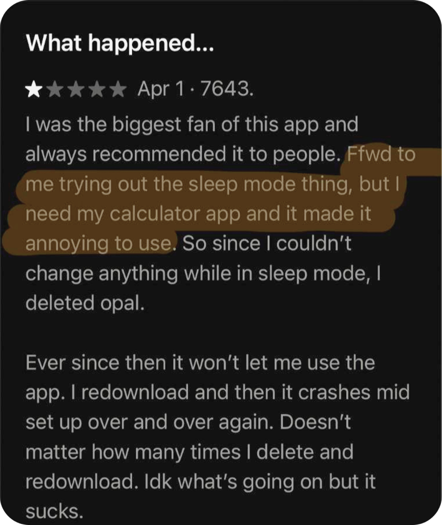
People sometimes need quick access to apps for work, communication, or everyday tasks.
Strict rules are harder to follow when motivation falls or a task becomes difficult.
When restrictions feel impractical, people may bypass them or stop using the system.
01 / DISCOVER / COMPETITIVE LANDSCAPE
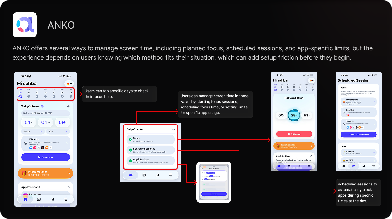
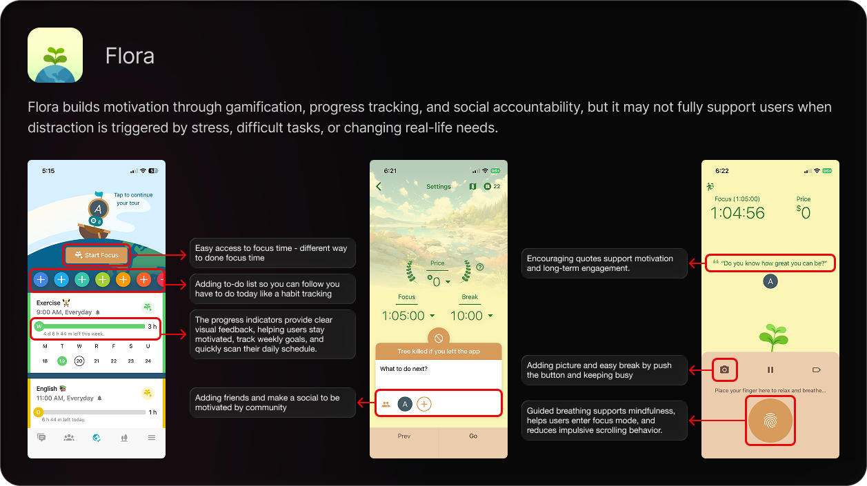
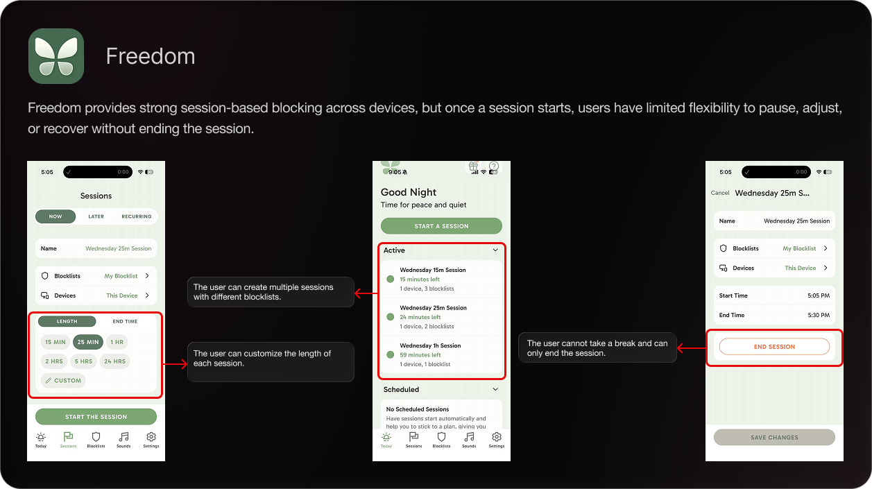
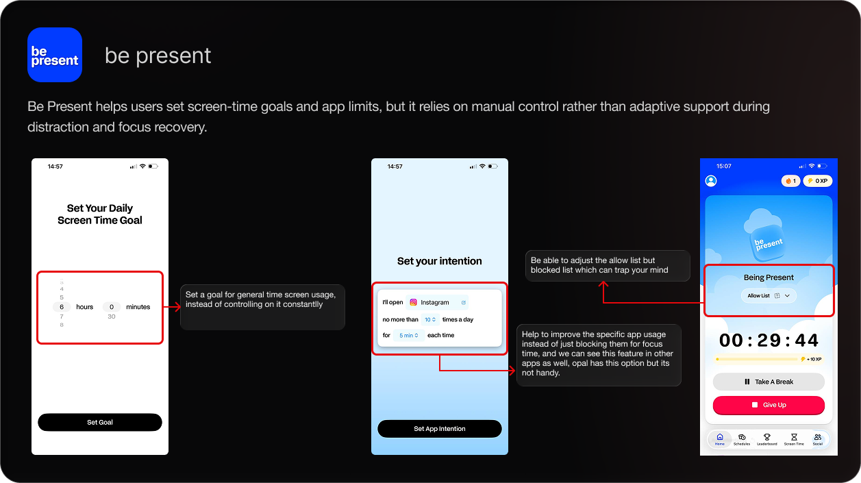
We compared Flora, Be Present, Freedom, and Anko to explore how other focus tools approach usability, motivation, and control.
ANKO
FLORA
FREEDOM
BE PRESENT
02 / DEFINE / TWO FOCUS MINDSETS
The research was synthesized into two goal-oriented personas: one needs support with less effort; the other needs stronger commitment and accountability.

EMPLOYEE / PARENT
“I want the system to understand my behavior automatically.”

STUDENT / STRUCTURED LEARNER
“Distraction happens when my brain wants to escape difficult work.”
02 / DEFINE / JOURNEY MAPPING
Mapping adoption, focus, distraction, return, breaks, and advocacy showed where support is useful—and where the experience creates friction.
Mike, Employee, Married Opens Opal, reviews his focus settings, and sets a session around his work routine.
 Works on his laptop while checking necessary emails or work messages.
 Gets pulled by stress, boredom, family interruptions, or notifications, then checks his phone.
 Sees the Opal reminder, realizes he is off-task, and returns to the work task.
 Takes a short break, uses allowed apps, checks news/social media, or responds to family needs.
Reviews progress and may recommend the app if it fits his real work-life needs.
Sima, Student, SingleSets app categories and connects Opal to her study routine.
Starts a focus session and works through her laptop.
Reaches for her phone or shifts to small side tasks.
Notices the reminder and returns to her main task.
Takes a planned break and checks allowed apps.
Reviews progress and shares the app if it helps her stay consistent.
Users already feel mentally overloaded, so manually choosing apps, schedules, and rules can feel like another task instead of support.
Strict blocking can conflict with necessary work, study, family, or communication needs, making the system feel unrealistic.
When restrictions are too easy to unlock, the system loses power and users feel like the app is not actually helping them stay committed.
Users often pick up their phone automatically during stress, boredom, difficult tasks, or small pauses before they fully realize they are distracted.
After distraction happens, users need help re-entering the task without guilt, shame, or complicated steps.
Break time is useful, but without clear limits, it can easily become long scrolling, extended app use, or task avoidance.
Users need to see evidence that the system is actually helping them, not just blocking apps. Progress should feel personal, visible, and motivating.
Reduce setup effort and connect the session to a clear purpose.
Offer understandable choices for interruptions, breaks, and returning to the task.
Make progress feel meaningful and support accountability.
02 / DEFINE / DESIGN CHALLENGE
The direction: flexible controls, a clear reason to return, and support that helps people stay in charge of their attention.
03 / DEVELOP / PRIORITIZATION
We used an effort–impact matrix to compare concepts by potential user value and implementation feasibility. The matrix helped narrow a broad set of ideas into a focused redesign.
Screen-time goals people can adjust
More visible screen-time controls
Peer alerts around broken streaks
Black-and-white screen option
Task list or calendar connection
Clearer break choices and reasons
Goal reminders after distractions
Habit tracking and small-task notes
Emergency access option
Screen-time preview before focus
Loud blocked-app warning
Focus insights from tracking data
Additional focus modes
Routine planner for parents
Prioritization guided which concepts to explore; the final prototype brought together a smaller set of related interactions.
03 / DEVELOP / DESIGN RESPONSE
The redesign connects clearer session controls with purposeful focus, peer support, and easier access to daily limits.
Step away for longer interruptions while keeping the option to resume.
Use a to-do list to make the purpose of a focus session visible.
Use social accountability to help maintain motivation and commitment.
Make the total screen-time control easier to notice and change.
Prompt people to reflect on why they are leaving a session.
03 / DEVELOP / USABILITY TESTING
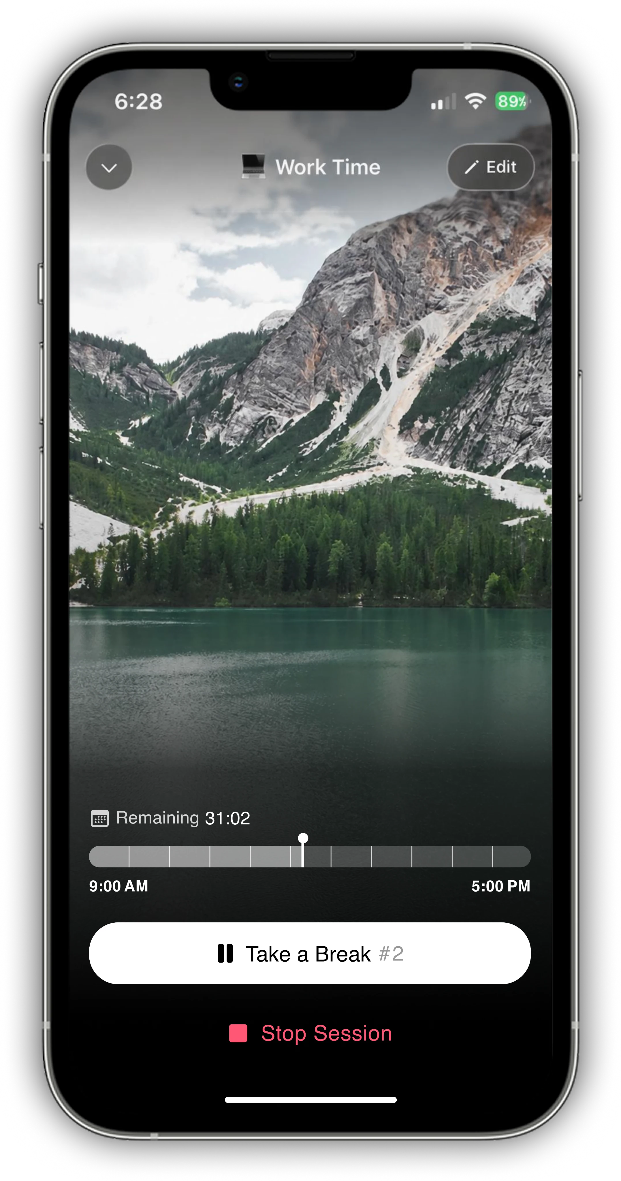
Participants encountered the designs without guidance. Their first impressions revealed two issues: competing actions in the focus view and unclear session controls.
The density of actions made the focus screen feel overwhelming. People did not always recognize which controls mattered in the moment.
Reduce secondary actions and move them into an edit flow. Keep essential session controls visible.
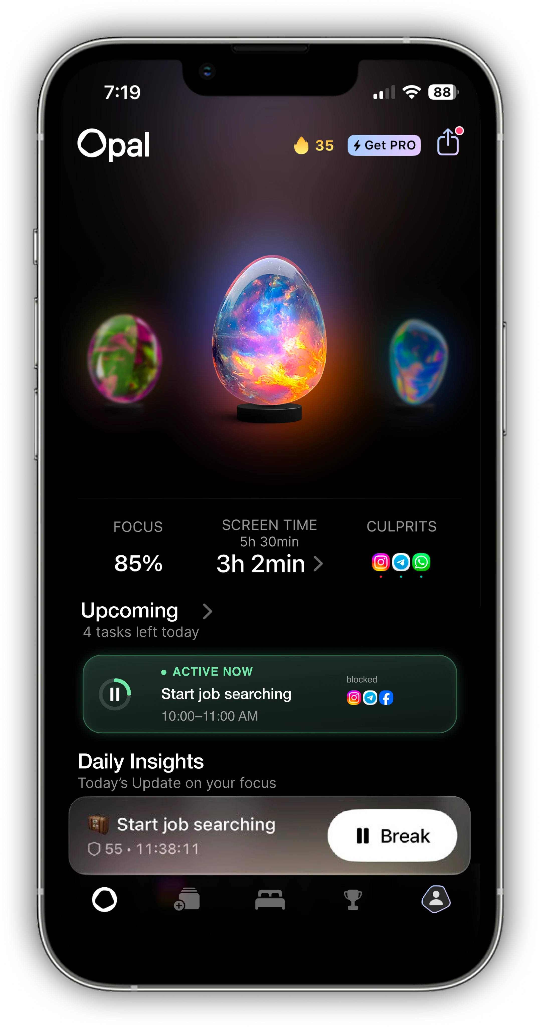
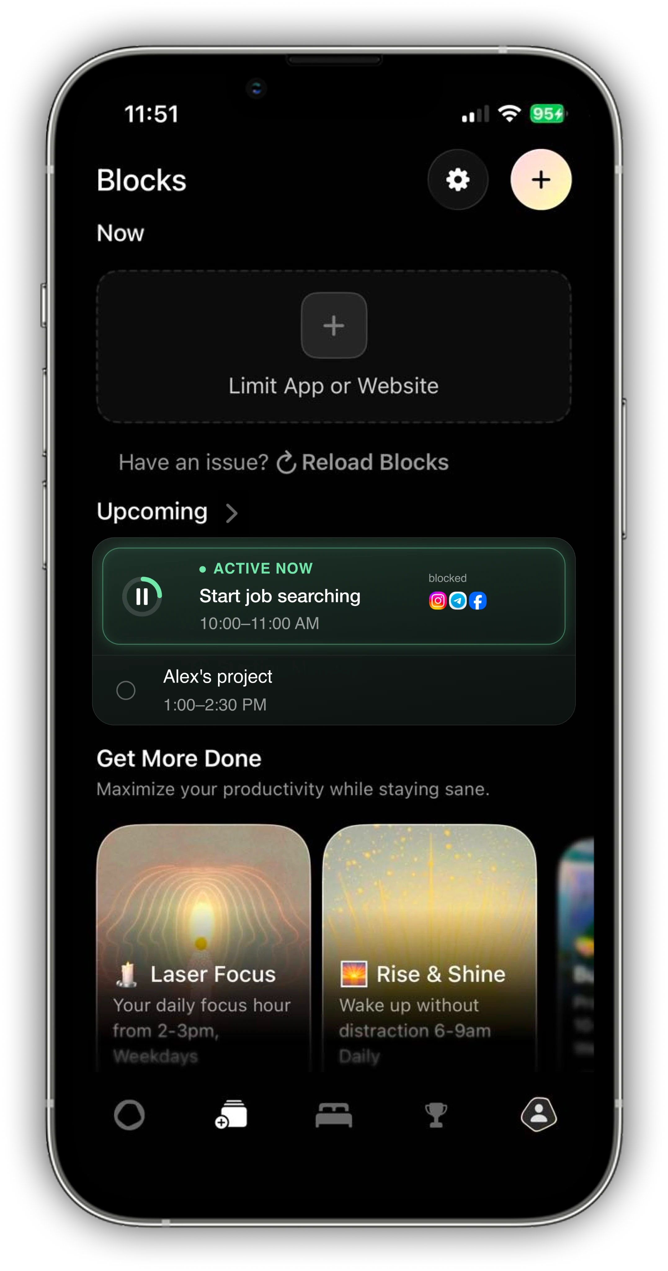
Multiple “+” icons were ambiguous. People confused adding time with creating a session and missed the distinction between session types.
Separate current and upcoming sessions, and make the primary action easier to recognize.
03 / DEVELOP / ITERATION 01
BEFORE
Several controls competed for attention and made the essential session actions harder to identify.
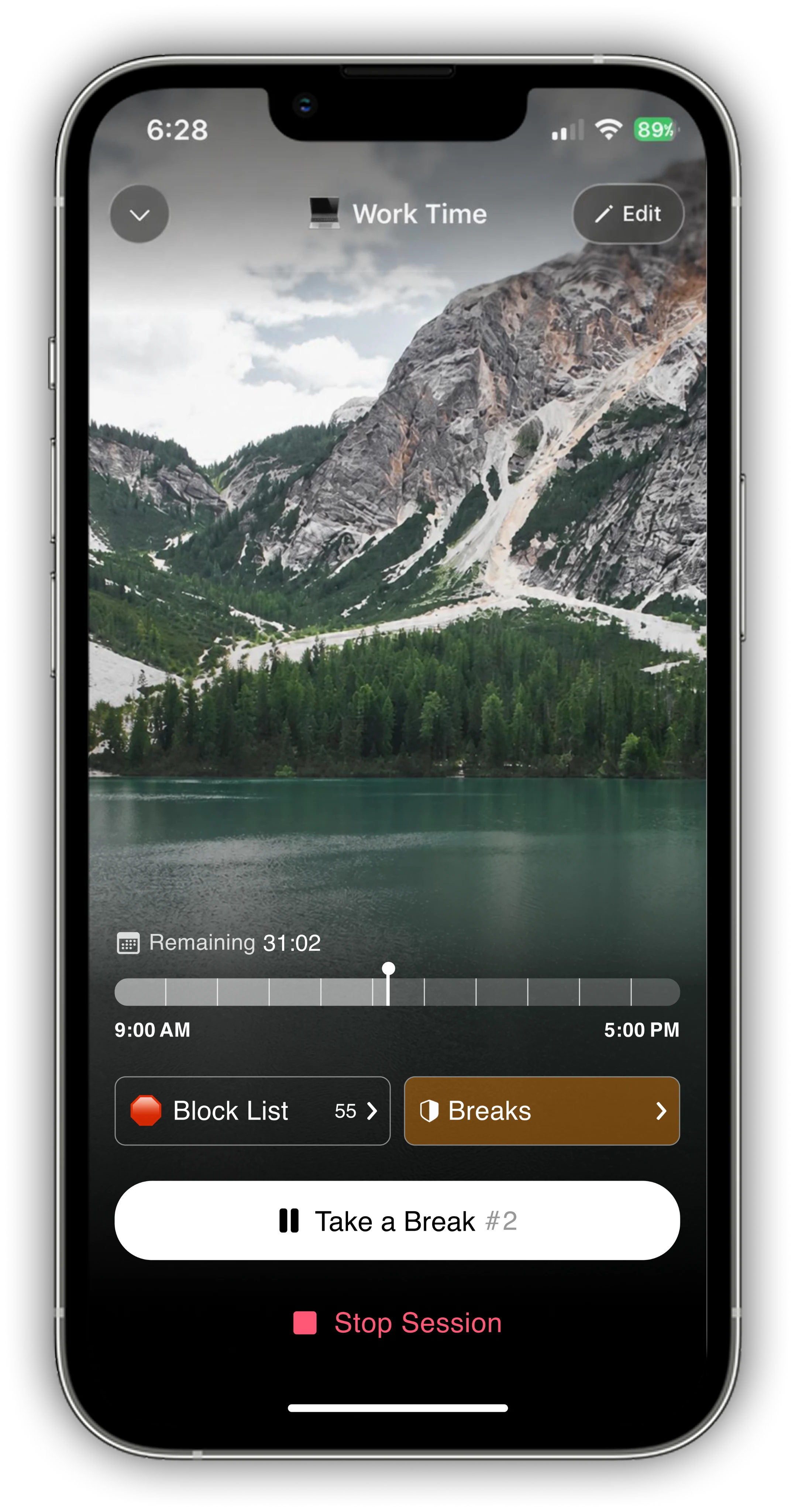
AFTER
Secondary actions move into an edit flow. The main session controls remain visible.
03 / DEVELOP / ITERATION 02
BEFORE
People had difficulty distinguishing regular and prepared sessions, while repeated “+” controls created uncertainty.
AFTER
Current and upcoming sessions are separated, with a clearer call to action and more recognizable controls.
04 / DELIVER / FINAL DESIGN
Four prototype walkthroughs bring the redesigned experience together: support from others, a clear purpose for each session, understandable interruption controls, and goals people can adjust.
01 / PEER SUPPORT
Notify friends when broken streaks become more frequent, bringing social support into the focus experience.

02 / TASK PLANNING
Add a to-do list or connect tasks to a calendar so there is a clear reason to begin—and return to—focus.

03 / SESSION CONTROLS
Distinguish Stop, Pause, and Break so people can choose how to step away from a session.

04 / DAILY GOALS
Make the daily screen-time goal easier to access, personalize, and adjust when needs change.

REFLECTION / WHAT I LEARNED
Managing screen time is an emotional experience as well as a productivity task. This project shifted my attention from enforcing a limit to helping people navigate the moments when focus becomes difficult.
Interruptions, breaks, and responsibilities are part of the experience. Flexibility needs to be intentional and easy to understand.
Small interface decisions—labels, grouping, and the number of visible actions—can change how people interpret a screen.
Evaluate the revised flows again, including how people understand pause versus break and how they want peer notifications to work.